Data visualisation and comms campaigns
At Ipsos Karian and Box I spent over eight years working on creative data visualisation and internal comms projects for various FTSE 100 and 250 companies in the oil and gas, retail, banking and other industries - most of which are either confidential or internal.
I designed reports that refined complex data into simple, easy to digest information that could communicate information to be read by the C-Suite. I used the clients existing branding or expanded on it to create colourful and imaginative data presentation reporting over the monochromatic wall of text, pie charts and bar charts that they have previously had from other suppliers.
This form of data presentation means that employee engagement results or business intelligence is more concise and easier to absorb in summary while also letting clients deep dive into specific areas like Diversity and Inclusion, Pride and Advocacy.


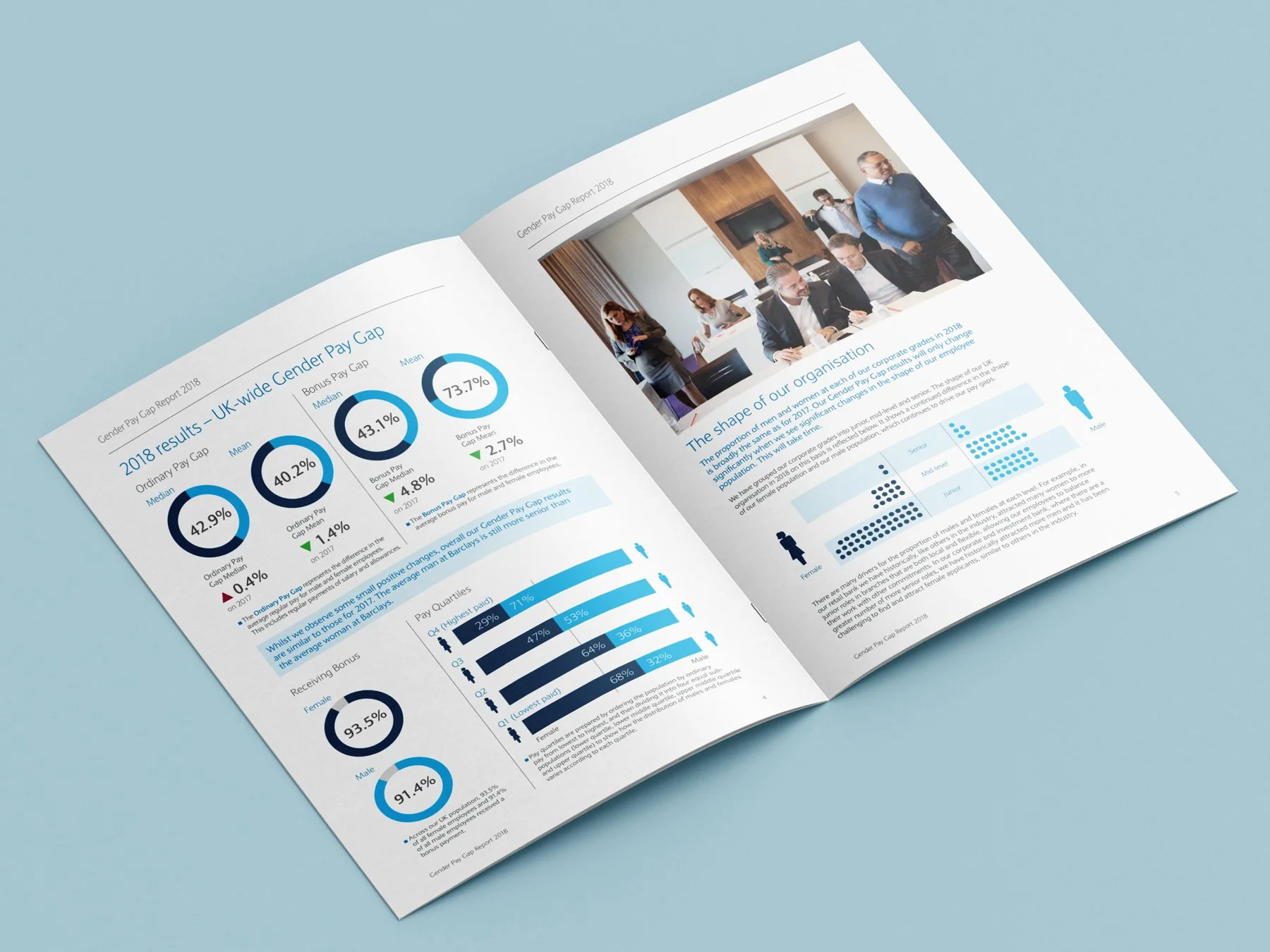
Barclays Gender Pay Gap reports from 2018 and 2019
A publicly available example of reporting. The Gender Pay Gap report is required by law to compare how companies with over 250 employees pay men and women. An online version was submitted and an extended print version for the C-Suite, HR and finance teams.

Neptune Energy
Multi year campaign work on safety and incident reporting including multilingual work in five different languages. These were used at on and offshore on sites plus in campaign assets like blogs and animations.
Storytelling through brand illustration
Story On A Page illustrations showing the customer journey for banking areas.
Anglo American
Multi-year internal comms campaigns, Safety and Code of Conduct and materials for the Applause Awards in multiple languages.
Irish Banking Culture Board example
Example of typical annual report design with employee engagement data visualisation for the financial sector.
Ipsos Karian and Box case studies and white papers
Examples of regularly published white papers and case studies.